

Designing Float’s 0-to-1 mobile app for business finance
The Problem
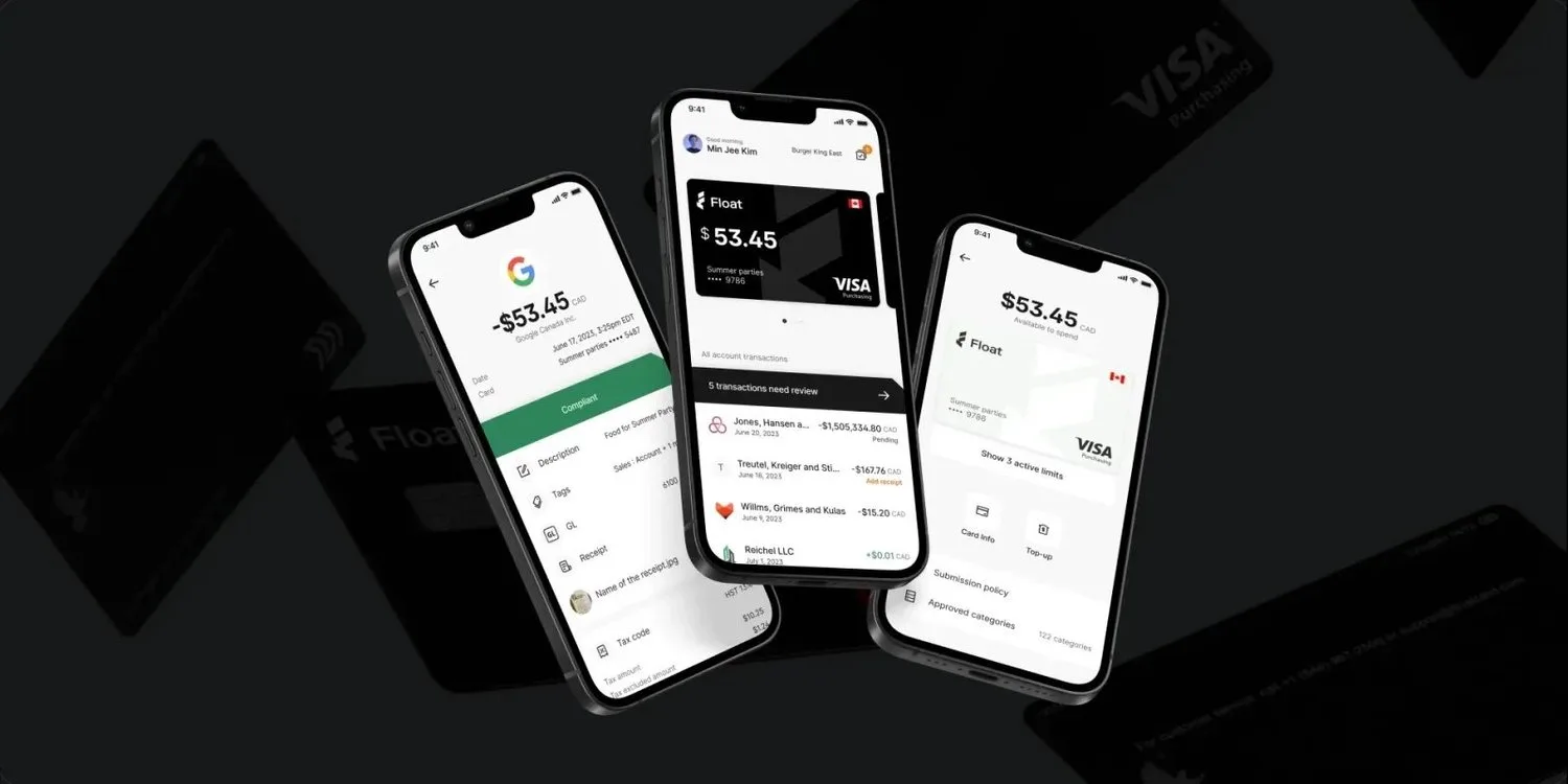
Float allows business employees to track expenses via controlled corporate cards on a single platform. The two key parts of this flow—receipt capture and card management—were still on the bootstrapped version of the product. Receipt capture in-the-field was done by employees texting receipts back and forth to a Float mobile number. And card management was only done via the Float website that was never optimized for mobile, even though 80% of card management flows were being done on mobile.
The objective
Launch a best-in-class mobile app on iOS and Android, allowing employee users to capture recipts, categorize expenses, and submit for reimbursement—all via mobile. Most of all, we wanted to reduce time-to-compliance—the time it takes for an expense to be submitted and categorized.
APPROACH
I started by analyzing the existing web app, and did scrappy customer interviews to identify the key jobs-to-be-done for our MVP. We made the decision to foucs primary on two personas:
Spenders. Employees who submit expenses. We wanted to remove as much friction as possible—both to the actual receipt submission, and in helping them categorize their transactions quickly.
Managers. Employees who approve expenses. Our objective was to have approval take the minimum number of taps by ensuring that managers had all the context they needed for approval 80%+ of the time.
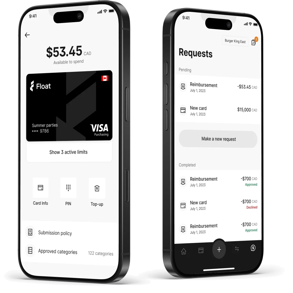
I designed an experience that made sure spenders could easily manage cards and request new ones in the app. When Spenders review transactions, they can instantly see which ones have been approved, declined, or need receipts added (with push notifications to help them stay on top of receipt compliance). As Spenders request reimbursements and card limit increases, Managers can seamlessly review and approve in the app.
MOBILE SYSTEM DESIGN TO
FUTURE-PROOF THE APP’S EVOLUTION
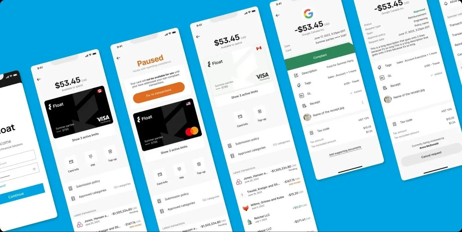
Throughout the process, I designed components to align with the desktop-oriented system we had already developed at Float. We also knew from user conversations that the we’ll-designed physical card represented the brand well, so we knew we wanted to leverage that imagery in the app.
At the same time, I used the app as an opportunity to introduce mobile-optimized component variations, and replace clunky supporting illustrations with on-brand visuals to reinforce a sense of trust in the Float platform.
I also introduced motion to the design system for the first time, including designing dynamic versions of the Float logo that we used for the start screen and loading states—with the animation rolling into the company’s marketing as a branding element.
Concept to high impact in 4 months
Float didn’t have internal engineers with extensive React and mobile dev experience, so my Product Management partner and I idetified an outside contractor who could help us get the app off the ground. In parallel, our Engineering Director peer hired a small mobile eng team to take the project forward—using the initial development process to help onboard our new team get ramped up.
The mobile app is now a key part of Float’s business finance platform, and the default way that business users interact with the platform day-to-day. The app reduced time to compliance (when a receipt had been submitted and categorized) by 36%, exceeding our goal of 25%. Our focus on users and design quality also saw us achieve:
❤️ Increase in Spender NPS from 42 pre-launch to 74 post-lauch
⭐️ 5.0 rating on the Android app store, and 4.7 rating on the iOS App store
Launching the app was a key element in enabling Float to raise their $70M Series B round a few months after launch.